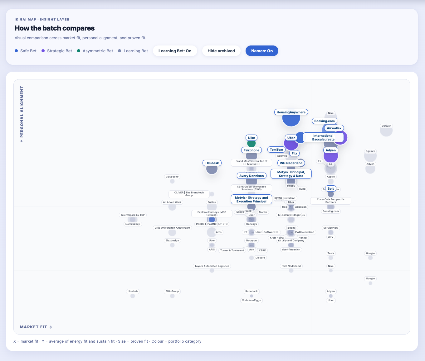
Opportunity Fit Map.
Once you are comparing multiple roles across different industries, titles, and trajectories, intuition alone stops being enough.
So I wrote my own formula for what a good job looks like, then turned it into a system.
Job search happened to be the use case. The underlying problem was more familiar: too many plausible options, inconsistent judgment, and no visible structure for the trade-offs.
The visual output is something I have been calling the Opportunity Fit Map.
The Y axis captures personal alignment.
Two questions go into it. First, how energising is this role likely to be? That includes the type of work, the environment, the problem being solved, and whether this is the kind of challenge I move toward or the kind I simply manage.
Second, how sustainable is it for the life I am building? Location, travel load, work model, and long-term fit beyond the job itself all sit inside that question.
I combine these into a single score because both matter. A role can be energising but unsustainable. Fast-moving, high visibility, and brutal on everything outside work. A role can also be sustainable but slowly draining. Personal alignment needs both signals to be true at the same time.
The X axis captures market fit.
How strong is the company in terms of career capital? How does the compensation compare to my actual target range? How relevant is this move strategically? Does it build the trajectory I am aiming for, or does it lock me into a lane I am trying to leave?
Market fit is not about brand recognition. A well-known company with the wrong mandate can score low. A smaller company with a genuine leadership seat and real upside can score high.
Dot size: proven fit
The third variable is the size of each dot on the map.
Proven fit is about credibility. Not potential. Not enthusiasm. It is the evidence that a conservative hiring manager would look at my background and see a natural match.
A large dot means the case is strong on both sides. A small dot means the opportunity might still be real, but the path to winning it is harder, and I need to know that going in.
Reading the map
The upper right quadrant, where market fit and personal alignment are both high, is where the most attractive roles sit. A large dot there is what I aim for most actively.
The interesting tension is around the edges. A role high on market fit but lower on personal alignment can still be worth pursuing, but it requires a different kind of preparation. A role high on personal alignment but lower on market fit is a different calculation. The fit is real, but what does this build toward?
That distinction is where the portfolio labels become useful.
Strategic Bet vs Safe Bet
Every role gets a colour on the map, a portfolio category that describes the nature of the move.
A Safe Bet is where both axes are high and proven fit is strong. The story writes itself. I can walk into that conversation prepared and credible. The match is real on both sides. It is not a guaranteed win, but the case is clear.
A Strategic Bet is where market fit is high but personal alignment or proven fit is lower. Worth pursuing, but as a stretch move. The role demands a sharper narrative and a clearer view of what is being traded. The win rate is lower. The upside, if it lands, is meaningful.
There are two more types. An Asymmetric Bet is where the upside is disproportionately high, but the path is harder. Worth attempting if no hard blocker exists. A Learning Bet is a role that gives me information as well as an opportunity. Even when the fit is not perfect, it can still help me understand the market better and refine how I position myself.
All of them can live in the pipeline. The colour tells me how to approach each one.
What becomes visible

The unexpected thing about building this map was not what it showed me about any single role.
It was about making my own judgment explicit. The formula, what makes a role energising, what makes it sustainable, what counts as a real market signal, already existed in my head. I was using it every time I opened a listing. Making it visible meant I could apply it consistently, with the same standard on an exhausting week or on a sharper week.
It also made trade-offs visible before I was emotionally invested in a specific option. When a role is a Strategic Bet, I know what I am trading. When a role is a Safe Bet, I know why. The decision is still mine.
In the next piece, I will go into the holistic profile, the self-knowledge layer that sits underneath the map and determines how the scores are actually set.